
Why Mobile Matters More Than Ever
Suppose a customer in Fresno pulls out a phone to search for an auto shop, HVAC service, or dog daycare. They tap your link and wait. If your site loads slowly or looks messy on a small screen, they leave within seconds and choose someone else. Thoughtful web design—fast-loading, responsive, and easy to navigate—keeps mobile visitors engaged and turns quick lookers into real leads.
In today’s market, a mobile-friendly website isn’t just a luxury. It’s the key to reaching local customers and converting their searches into calls and bookings.
More than half of local searches now happen on smartphones. When people need a quick service, like AC repair on a hot day, they rarely sit at a computer. If your website doesn’t work perfectly on a phone, you lose them to a competitor who invested in a responsive design.
Search engines also notice. Google ranks mobile-friendly sites higher in local results. A slow or outdated site can push you down the page, making it harder for customers to find you at all.
The Cost of a Non-Mobile Site
A site that isn’t mobile-ready turns customers away in three major ways:
-
Slow loading times cause impatient visitors to close the page before it even displays.
-
Clumsy navigation makes it hard to find contact info or schedule service.
-
Poor visuals, tiny text, and misaligned images signal that a business is outdated or careless.
These small issues add up to lost leads and wasted marketing dollars.
Elements of a Mobile-Friendly Site
A mobile-ready site is more than a smaller version of a desktop design. It requires careful planning to give users what they need fast:
-
Responsive design that automatically fits every screen size.
-
Responsive design that automatically fits every screen size.
-
Easy calls to action, like a “Call Now” or “Book Service” button, are always visible.
-
Clear navigation with simple menus and concise copy.
These features work together to keep visitors engaged and guide them to contact you.
How a Strong Mobile Site Boosts Local SEO
Local SEO and mobile design go hand in hand. When your site loads quickly and works on phones, Google rewards you with higher local rankings. That means more visibility in “near me” searches, more clicks on your Google Business Profile, and more calls from nearby customers.
For Fresno businesses, that can be the difference between getting the job and watching a competitor take it.
Why DIY Builders Often Fall Short
Cheap website builders often promise mobile compatibility, but many actually create bloated code and slow-loading pages. They rarely provide the flexibility to fine-tune for speed, design, or SEO. What looks fine on a desktop may still frustrate mobile users.
If you depend on a low-cost builder, you may think your site is mobile-friendly when it’s quietly losing you customers.
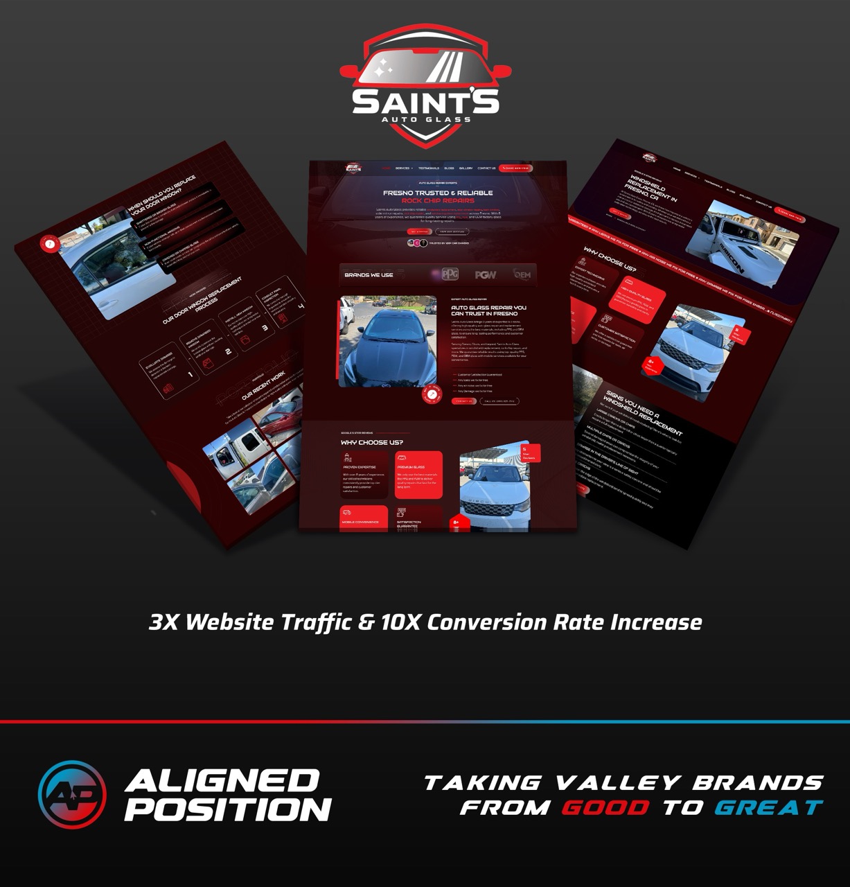
Where Our Clarity Method Comes In
Designing a fast, responsive site is only part of the solution. To truly convert mobile visitors into paying customers, you need a complete strategy. That’s where our Clarity Method helps.
Clarity is more than web design. We create mobile-optimized sites and combine them with local SEO, paid ads, review management, and precise tracking. Every element works together, so your marketing dollars bring measurable results.
With Clarity, you’ll know exactly which campaigns lead to calls and which pages drive bookings. You won’t wonder if your website is pulling its weight; you’ll see it in your revenue.
Real Impact for Local Service Businesses
We’ve helped Fresno auto shops cut bounce rates by speeding up mobile load times. HVAC companies have booked more emergency calls after adding one-click “Call Now” buttons. Dog daycares have filled boarding spots by making online reservations effortless on a phone.
These improvements don’t just look nice. They deliver more customers, faster.
Take Action Today
Your website is often a customer’s first meeting with your business. If it’s slow or hard to use on a phone, you’re losing leads every day.
Aligned Position can design a mobile-friendly site and integrate it into a full marketing system with our Clarity Method. We handle the design, SEO, ads, and tracking so you can focus on serving your customers.
Schedule a free 30-minute discovery call today. We’ll review your current site, identify what’s holding you back, and show how the Clarity Method can turn mobile visitors into loyal local customers. mobile friendly websites local